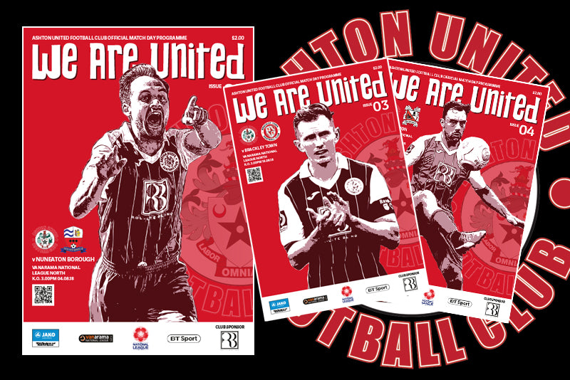
Case Study: Ashton United Programme 2018-19
For the Ashton United programme 2018-19 we decided to do a redesign, instead of using standard colour player photos we went with an illustration style. The colours we chose were different shades of the Ashton red to give the programme a unique feel. The mast head font was changed to a typeface that complemented the illustration and completed the look.
Over the course of the season free posters were issued in the programme with a collage of the illustrations from previous programmes, each poster could be joined up to make one large poster with parts of the illustrations crossing over the joins from one poster to another.

